Saturday, 16 June 2012

'L'Italia Corporativa' (Fascist Work) by Mario Sironi (1936-37)


During the first half of the 20th century, where two world wars were fought, art, once again became a tool for political propaganda. The aesthetic culture of the Nazi regime is well known to most, but within Italy, artists such as Mario Sironi also used art to reiterate Fascist principles. Sironi really began as an artist of urban landscapes, depicting barren, empty cities that were critical of the Italian Socialist government and an Italy that had, to Sironi,  become dreary and dull. When Mussolini seized power, Sironi seemed to find an affinity with the new Fascist government, joining the Novecento, a group headed by Mussolini's mistress. Even after the break-up of the Novecento, Sironi's relationship with Mussolini grew stronger and in turn, Sironi became the premiere artist of the new Fascist Italian state. 
Mussolini sought to form a new 'Roman' Empire reminiscent of the great Roman Empire that had ruled over Europe more than 2000 years previously. The first real decisive example of this is the Second Italo-Abyssinian War (or the Ethiopian War) that began in 1935 and ended in 1936. The war marked the successful conquering of Ethiopia and the beginnings of a new Roman Empire. For Mussolini, a ruler that had seized power through force, propaganda, and military success were integral to keeping the Italian citizens content. In respects to art, Mussolini and Sironi found murals and bas-reliefs to be the best carriers of the Italian Fascist message. This message repeatedly referred back to Antiquity and the Roman Empire, and marked a new Classicism within Italian Art.

We see in 'L'Italia Corporativa' many references to Classical Roman culture including the attire of the figures, the use of mural (a very public art-form) and the dominating image of Italia in the centre of the piece, a visual representation of the Italian (and Roman) Empire. Sironi incorporates aspects of modernity too though. The eagle represents the Fascist political party and in the lower right-hand corner we see a modern soldier. The image of the soldier again affirms the relationship with past success and the importance of military strength. The soldier also serves as a celebratory figure, reminding the audience of Italy's 'accomplishments' in Ethiopia.


Friday, 15 June 2012

'Holy Virgin Mary' by Chris Ofili (1996)


Winner of the 1998 Turner Prize, Chris Ofili was no stranger to controversy. His use of elephant dung within his creations was, by his own admission, a hook to draw attention to his work. The dung also serves as a reference to his African roots and is essentially a visual representation of Africa, placed carefully into Ofili's paintings, and not, as some believe, thrown haphazardly upon the canvas. Within 'Holy Virgin Mary', Ofili is at his most controversial, depicting the Madonna as an unflattering, dark-skinned image, her right breast (made of dung) exposed to all. In the background we see numerous cut outs of female genitalia taken directly from pornographic magazines. When exhibited in New York, the then mayor Rudy Guiliani found it offensive, but I would disagree. The work is a great example of the use of contradictions in art where sex and virginity, cleanliness and perceived dirt and the image of a dark-skinned Madonna are difficult to digest.

In this quintessentially Renaissance image of the Virgin Mary by Raphael, we see an emphasis on pure white skin, piety and virginity. We see that, much like Carrie Mae Weems' 'Mirror Mirror', Ofili has taken an image of white purity and played upon it to create a striking piece of art. What Ofili ultimately accomplishes is an image that engages with racial prejudice by giving the viewer a stereotype. Ideas of overt black sexuality are emphasised to an extreme and placed before us. By viewing these stereotypes in such a bold way makes the viewer engage with their own prejudices. We are in essence so used to seeing a particular image of the Madonna (and indeed Christ) that we are confused by Ofili's depiction and question the images of the Madonna we have seen previously. We are told that Jesus was born in Bethlehem, yet the most famous depictions of him, and his mother show a purely white skin-tone. Much like Weems, Ofili is engaging with a history of prejudice and Ofili asks if it purely the sexual content that is so striking and controversial. Unfortunately, as is generally the case, controversy comes from misunderstanding and misinterpretation. Ofili isn't being blasphemous but playing with racial stereotypes and forcing us to converse with our own ideas of religion and race.

Wednesday, 13 June 2012

'Mirror Mirror', Carrie Mae Weems (1987)

Throughout the History of Art it is in essence the white male that has been at it's epicentre. Within the latter half of the 20th century, Black art began to grow, but again, the emphasis was on the male. Carrie Mae Weems' work dealt with what it was to be an African American woman within a white mans world. Within 'Mirror, Mirror' Weems deals with the ideals of beauty and the prejudices that African American women deal with when sex-symbols are predominantly white.


The work references the well-known tale of Snow White (as seen above within the 1938 Disney animated feature) and specifically the way she is seen to represent the epitome of feminine beauty and grace. Her name itself emphasises the connotations of black and white on a purely aesthetic basis. White is the colour of purity and light whereas black is dark and menacing. It's ideals such as this that seem to be learned from an early age. Snow White as a feature film appeals to children, entertaining but also teaching with it's depictions of good vs evil. Weems plays on the fact that Snow Whites pale complexion is an integral part to her perceived beauty. Weems sees the lack of black female sex symbols and relates it to such childhood stories as Snow White and how during the 20th century, it was the white female that came to represent glamour, beauty and sexuality.

Sunday, 3 June 2012

Tourists (1988)

'Tourists' is probably Hanson's most famous works and is really indicative of his ability to create extremely realistic sculptures. Again we see an engagement with obesity as part of American (and indeed the World's) culture and society. 

 Tourists is less overtly critical of obesity than 'Supermarket Shopper' but we are still made to engage with our own perceptions of obesity. With 'Tourists', Hanson isn't forcing us to either celebrate or be repulsed by obesity but instead appreciate the people behind the weight and understand that our initial reactions aren't necessarily true. Obesity is dangerous to an individuals health but it shouldn't control our opinions on a person. We must ask ourselves about the people we love and if they have weight issues? Obesity is unfortunately a major problem and as a result has become a key aspect of modern culture. Hanson wants us to delve deeper into both his work and the aspects of life his work represents. This is what makes him a truly great artist instead of just a great craftsman.

Bowery Derelicts (1969)


What we get most from Hanson's work is the allowance to stand and stare and therefore really take in the image on display. Within Bowery Derelicts Hanson has created a startling and wholly realistic depiction of homelessness and the affects of alcoholism. 


Hanson's striking realism allows us to view these figures at their lowest ebb, something that general courtesy doesn't within the 'real' world. Hanson is inviting us to really engage with the suffering of the figures, and, instead of walking by, like we would on the street, we are made to fully emphasise with the plight of the homeless and re-think our own interpretations of these people, their reasons, and their daily existence.

Saturday, 2 June 2012

Supermarket Shopper (1970)


Supermarket Shopper is a rather grotesque look at the modern American relationship with food. Much of Hanson's sculptures deal with obesity but in a less critical way. Hanson himself felt that the scultpure was too critical in it's depiction of an obese woman, piling up her trolley with unhealthy, processed food. We judge the figure for her over-eating yet deciphering the products within her trolley we see correlations between our eating habits and those of the figure. For example Coca-Cola is the largest drinks company in the world, we all have at least once drank a can of Coca-Cola. This gives an affinity to the sculpture in that we judge her for her obesity, yet, we ourselves are guilty of giving into similar temptations.

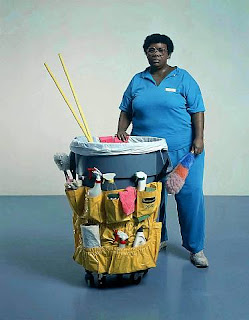
Queenie II (1988)


Queenie II was one of Hanson's favourite sculptures and one of the only pieces he named. Queenie II is one of my favourites too because it celebrates so perfectly the forgotten everyday worker. Hanson believed that we tend to forget that, outside of our own homes, someone needs to clean up after us. Hanson is giving us a chance to really identify the lower-class worker who does look tired, and maybe over-weight but does a hard job for very little and we need to remember the importance of Queenie and the job that she does.

Sunday, 22 April 2012

Race Riot (1968)


Race Riot came at a time where Hanson's work concerned itself primarily with a strong moral and social conscience. The image above is the original and completed Race Riot, which due to fire has all but been lost. What still exists is sculpture to the left, known, and exhibited now as Policeman and Rioter.


Although an incredibly striking sculpture that brings to light the issues of police brutality and racism, Policeman and Rioter loses the initial impact and context of Race Riot. In Policeman and Rioter we see a young African American lying, defenseless on the ground whilst a helmeted police officer kicks him and prepares to hit him with a baton like weapon.


The attire of the African American man can be seen to refer back to the image of slavery creating an image of both modern and historical African American oppression.

If we look at Race Riot again, we see an image with a similar, yet differing attitude to that of Policeman and Rioter. The most striking difference is that the violence is two sided within Race Riot. We see two African American figures brandishing weapons including a machete (another reference to agricultural slavery?). The image we are given then is an image of war, as opposed to solely an image of African American opression and we ask ourselves who's the real winner when a fight for freedom becomes a bloody battle?

Tuesday, 17 April 2012

Duane Hanson


Duane Hanson (1925-1996)

The first artist I will be discussing is Duane Hanson. Hanson is currently the subject of the dissertation I am writing, and so he's the perfect artist for me to begin my blog.

In my humble opinion, Hanson is one of the great American artists of the late-20th century, but also one of the most neglected and underrated. His work consists mainly of hyper-realist sculptures made of autobody filler, polychromed in oil and made to look as life like as possible. Hanson used the people around him to create full-body casts that he would dress and paint in incredible detail as to form a sculpture as true to life as humanly possible. Time and time again audiences have mistaken Hanson's sculptures for reality, even going as far as to ask them questions. To see this as a gimmick or a hook is to do Hanson a dis-service though because his work is not only beautifully crafted, but also an accurate and sometimes shocking image of American society. 


Hello

                                            Pablo Picasso, Guernica, 1937

Introduction 

My name is Chris and I'm currently a History of Art student in the UK about to complete my Bachelors degree. This blog is going to be about my love for everything Art and will consist of me choosing one artist each week and picking five artworks from each artist and, examining and reviewing each artwork. Inbetween I may post reviews of exhibitions I have seen or investigate some noteworthy news items. Hopefully, as the blog begins to grow this will allow a forum for some discussion. And that's basically it, hope you enjoy it.